What makes a livery great?
So really, what makes a livery ... a “good” livery? What makes a livery...the "best" livery? Is this a completely subjective opinion or are there actual livery design best practices to employ in order to generate a classic looking Indycar?
The chassis is a great place to start. The canvas that the paint and decals sit on, is directly correlated to the end result in the visual design. You don’t have to be the next Nigel Bennett to understand why so many of the greatest looking Indycars came from the 90’s...specifically the late 90’s when you had the most visually stunning chassis in the history of the sport. This means no extruding pieces and extraneous body parts. Using rounded edges and a curved nose with low center of gravity cockpit along with side pods that are big enough to properly showcase a brand but not obtrusive to the overall look.
Yes, the chassis matters and its unfortunate the cars of the 2000's just have not had that great canvas to put their liveries on.

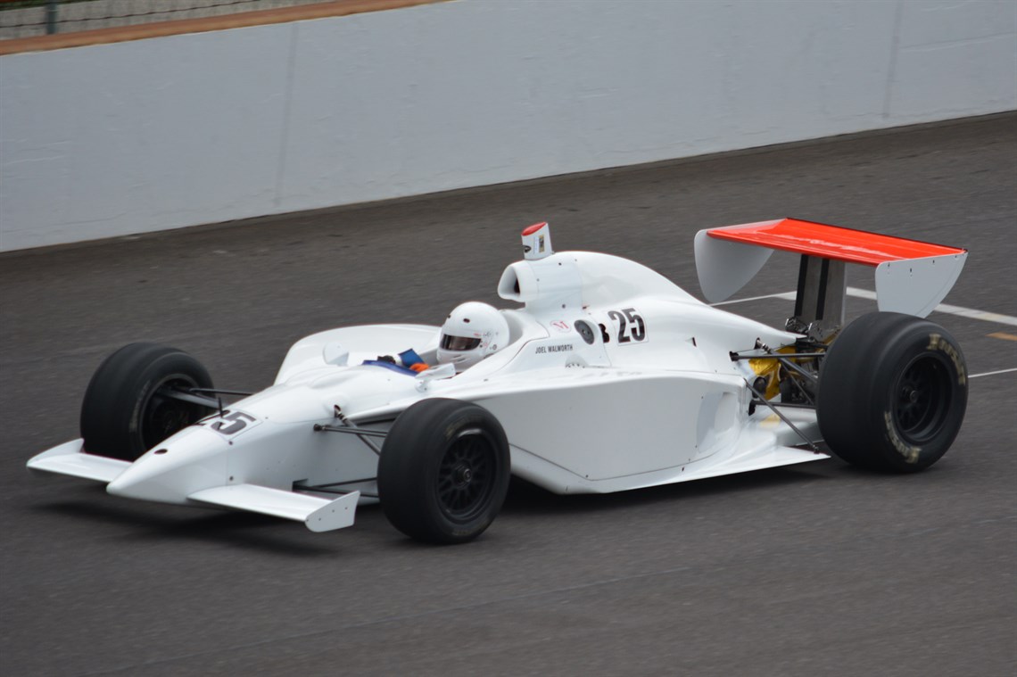
The Reynard 96i may have been the best Indycar chassis on and off the track. and then compared that to the G-Force IRL chassis. The greatest paint scheme ever couldn't save that chassis. Source Wikimedia
Don't ignore the nose. A consistent theme with some of the best liveries has the nose of the vehicle being leveraged as a meeting point of sections or as the most distinct feature on the car. For example, look no further than the Eagle. Delivering on the “Eagle” namesake but also using the distinct yellow to highlight the predominantly white and green color scheme.
This is also a big reason why the Sealmaster livery of today gets such high praise. Thinking of these vehicles as more than just... a vehicle helps.
"Keep it practical around areas that might need constant upkeep and go detailed in those that don’t, many teams value a livery that will not waste their time (or their budgets)," says Aldo A. Falla of ALFA livery designs. "There is no book on how to do this, it’s gotta feel good, when the design is good it will speak to you ."
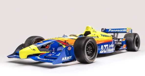
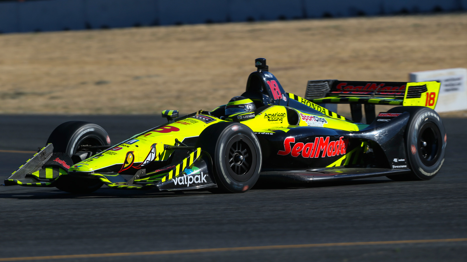
Distinct and defined noses. Image source Autoweek
Lines matter. It may sound obvious but more often than not, line breakers are not used to delineate sections of the chassis with the color schema. Even the simplest of liveries dominated by a single color leverage well thought out lines. The best example of said use would the KOOL livery of the late 90’s (of course sitting on the beautiful Reynard doesn’t hurt).
Modern day livery designer Aldo A. Falla says "don’t fight the body lines, go with the flow."
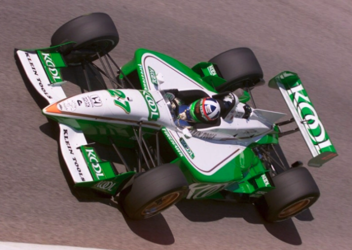
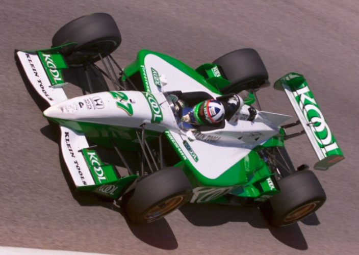
KOOL with and without the gold lines.
As you can see above the gold lines aren't directly matching the contour of the chassis, rather they are there to create a buffer between the chassis curves and the green/white scheme. Without the lines the livery would not have had as much “pop” to it.
Use of distinct and contrasting colors. Sometimes it seems that designers forget that the backdrop of the car is predominantly dark and grey. And the medium of which it is mostly seen is through a camera lens following an object traveling at 200mph on a television screen. So what does this all mean? You need colors that stick out! Opposite of grey and contrasting colors to the rest of the vehicles on screen. This is why the Players livery always stood out.
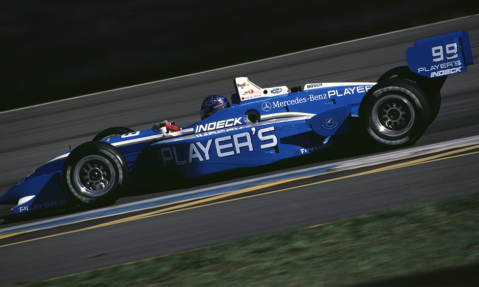
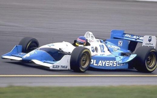
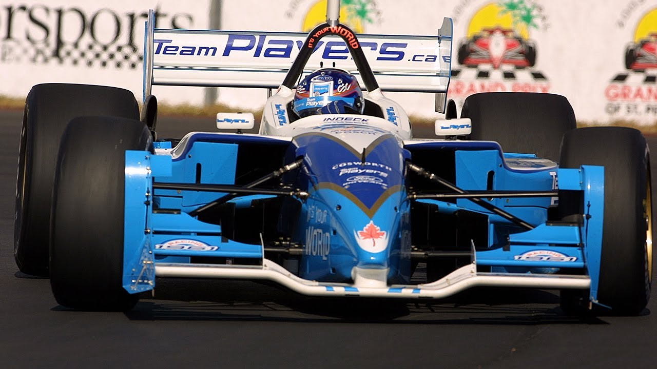
Did not matter the year, the Players livery always stood out on the track with their unique blue and white scheme
This color combination was also a good example of how to take a brand style guide and apply some design liberties to use it on an Indycar vehicle. As a viewer recognized the powdered blue car on track this creates the visual memory which ultimately turns into a long lasting connection between the brand, the livery and the fans.
Remember, simplicity isn’t a bad thing. It’s hard when you are trying to sell as much in sponsorship dollars as you can... but sometimes “less is more” when it comes to an Indycar livery design. Look no further than the Pennzoil machine of Rick Mears. It’s yellow. It’s simple. It has a clearly visible brand but strikes the perfect balance between color, brand and car.
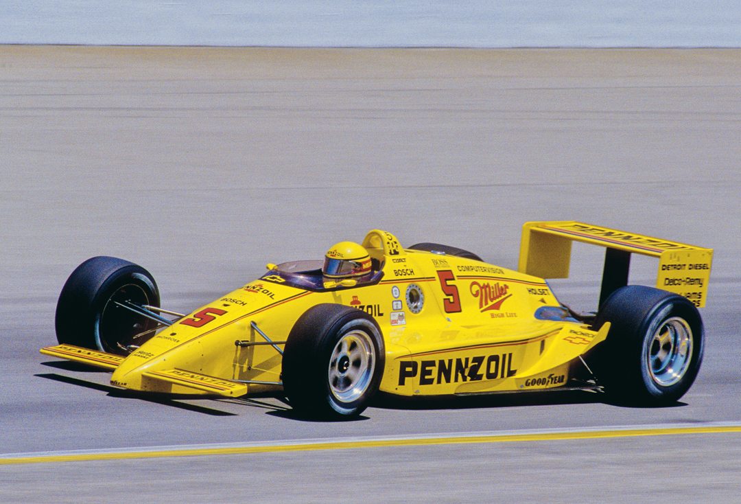
Clean. Simple. Sleek. Photo: Jim Hatfield
Finally, there needs to be a connection. A connection between the driver, the colors and the fans. The very best example for this was the Adrian Fernandez designed Tecate livery which brings in the colors of the Mexican flag while tying in the brand styles. Pairing that with a unique layout not seen on any other vehicle at the time, makes that connection.
This is why the Tecate livery won #liverymadness last year. It becomes more than a vehicle. It becomes more than colors. It becomes a symbol of national pride and when that vehicle wins... the country wins and ultimately the fans win.
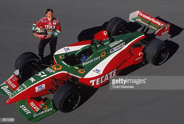
Fernandez Racing driver Adrian Fernandez with Tecate/Quaker State/Telmex Honda Reynard.Mandatory Credit: Todd Warshaw /Allsport
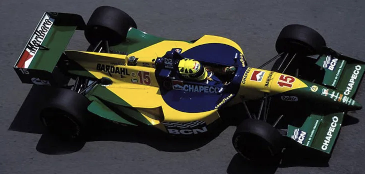
Tecate and BCN pulled on their countries strings with their liveries
So what exactly makes a livery great? The short answer... everything. There is no step by step blueprint and that is what makes the entrants in the #LiveryMadness tournament the best.
They are each uniquely powerful that broke the mold when it came to livery design.
Now go vote on your favorite livery in #liverymadness!
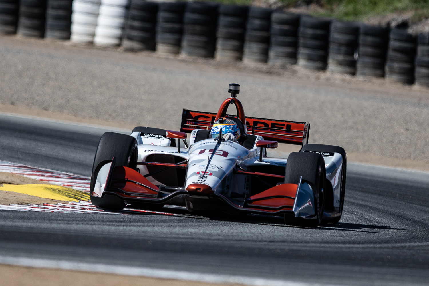
Santino Ferrucci may be the one holding the off season cards at the moment... where will he end up for 2020?
Like this type of content? Want more?
Submit your email address below so we can email it to you.